Tag Archives: comic books

Review: GREENIE JOSEPHENIE by Christopher Sperandio

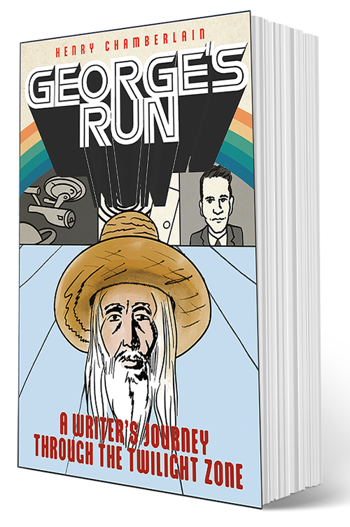
Greenie Josephenie by Christopher Sperandio

Greenie Josephenie. Argle Bargle Books. 2021. 94pp, $21.95

Comics, just like any other media, are often recontextualized and there’s no stopping it, maybe especially for misbegotten comics, in the public domain, that have fallen into a vortex of utter obscurity. There are a lot of these misfits and misfires just gathering dust. But one’s man trash can be another man’s treasure, as the ole saying goes. And so it is in this case. Artist Christopher Sperandio saw an opportunity to create new and fun narratives from old washed-up comics trash–and the trashier, the better! Who knew what art might someday be created from such mediocre and exploitative work like women-in-prison comics! Inserting new text into old comics is not exactly new. You see it all the time on social media. But Sperandio is in it for an extended and robust thematic exploration. His latest book is out this month and it follows the adventures of a renegade activist-superhero, Greenie Josephinie, a continuation of the Pinko Joe saga. It also invites the reader to follow along upon a most offbeat path dotted with landmines of subversive humor.

Recontextualizing like mad!

It’s the droll humor of Christopher Sperandio that seems to guide readers as they navigate through the murky world of the realpolitik. Sorry, sonny, this ain’t no place for children or cry babies! Morality has gone out the window and corporate profits are king! It’s a clever concept of injecting new and funny text into tired old comics and I give Sperandio a lot of credit for seeing it through. I think a process like this can be taken for granted after the reader becomes familiar with it. I think what keeps it interesting is all the neatly inserted provocation. You are almost dared to keep reading. You don’t read this like a typical comic book but more as you would view a series of work in a gallery. This is not a comic book. This is culture jamming. You see that the joke is only part of the work. The act itself, the successful reworking of the “found art,” taking it from its original genre and transforming it into protest art is the aim. If the jokes are really all that funny, that is beside the point–and yet, the humor remains part of the glue that holds it all together. Funny how art can get so complicated!

The droll humor of Christopher Sperandio

In a world where capitalism has run amok, what else can one do but turn to superhero types who are true blue real patriots? Yeah, and so a hyper-convoluted story ensues. It is far more cerebral while, at the same time, far more silly than many genre comics out there. Although, mainstream comics publishers today can often prove to be quite artful and do a good job of keeping at bay any easy satirizing of their product.

You can just run with it.

Sperandio goes to the trouble of attempting to show respect for the creators of the public domain comics he has used as found art fodder by including their names. That’s a totally reasonable and honorable gesture. Real human beings did create the artwork in these shaggy dog comics of yesteryear. But I wonder how many of these creators who are still around are losing any sleep over the fate of these particular creations. Honestly, this is C-level journeyman work, just work-for-hire grunt work, not any better nor worse than typical clip art. Honest work to be sure but no one is trying to win any prestigious award from it.

A learning opportunity.

Found pop art, and the noble work of recontextualizing it, brings to mind the Pop Art masters, specifically Roy Lichtenstein, who carved out a very significant place for himself with his use of comic book motifs. What Lichtenstein did was hardly new and dates as far back as the first artist who chose to incorporate other art into his own. One prominent figure, and my favorite, perhaps the first to really succeed with it was Edouard Manet. A more recent example is Shepard Fairey. Both Lichtenstein and Fairey have wrongheadedly been slammed by critics for appropriating the work of others. Manet not so much, or not at all, since Manet is no longer as commonly known; most people don’t care, nor would it make any sense for them to care. The bottom line is that reworking art into another work of art is sound and legitimate. It all comes down to what the results are and knowing how to avoid the trap of “garbage in; garbage out,” which is certainly not the case with Sperandio.

The little handy handbook to making comics.

I applaud Sperandio’s efforts and sincerely would love to chat art with him over a coffee or beer. Christopher Sperandio is doing essential work out on the front lines of higher education. Be sure to check out Comics Making, also published by Argle Bargle, a little book that covers quite a lot including a short history of comics and notes on production. Also in the book, Sperandio provides a guided tour to all the fascinating activity related to his CATS program at Rice University. I wish that had been around when I was working on my own college paper comic strip. The fact is that “comics making” is essentially a solitary process–but the right level of support can prove to be invaluable. Sperandio is a very interesting artist who has pushed himself throughout his career resulting in such creative achievements as Cargo Space, his artist residency project on a bus that he started in 2012. Other notable recent projects include working with fellow Rice professor Brian Huberman to see through the completion of a documentary on cartoonist Jaxon, which premiered at the 2020 Angoulême comics festival.

It’s all in how you handle your found art!

So, Speranio’s process is one worth perpetuating: mining for gold, or diamonds, for as long as it makes sense to do so. Depending upon the right chemistry between “found image” and wry joke, all sorts of magic is possible. Sometimes the results may fall flat. But, ah, sometimes you end up with a real gem. It’s all in how you handle your found art!

Find GREENIE JOSEPHENIE and other fine books at Argle Bargle Books!

2 Comments

Filed under Comics, Graphic Novel Reviews

Review: ‘Lily Renée, Escape Artist: From Holocaust Survivor to Comic Book Pioneer’ by Trina Robbins

Lily Renee, Escape Artist

Lily Renée, Escape Artist. written by Trina Robbins. art by Anne Timmons and Mo Oh. Graphic Universe (Lerner Books). 2011, 96pp, $9.99

Lily Renée, a comic book pioneer, celebrates her 100th birthday this week, on May 12th. Defying the odds, which included evading the Nazis, Lily Renée secured her place in the history of comics. Another comics pioneer, Trina Robbins, was inspired to take Renée’s story and turn it into a graphic novel. This book stands out as a compelling biography that is meant for younger readers, probably up to teens. It’s a gentle narrative meant to relate to readers in their formative years that focuses on Renée’s early years with some hints as to what lay ahead once her family is able to move to New York.

How best to tell the story of someone who survived the threat of the concentration camps–and then sort of stumbled upon and got to play a small role, as a woman, within a “man’s world” during the great golden age of comics? I believe Trina Robbins got it just right! As I suggest, this is a character study, one best appreciated by readers who are still getting their first batches of history and processing it. The art by Anne Timmons and Mo Oh is right in step with the crisp narrative. All in all, this is a great example of the sort of informative book that can be read in one sitting, perhaps as part of a classroom presentation.

Lily stumbles upon her destiny.

In 1938, Lily Renée Wilheim is a 14-year-old Jewish girl living in Vienna. She proves to be a natural artist and that provides a hook, a purpose. Then the Nazis march into Austria. The Night of Broken Glass was not just a nightmare, as young Lily first thought, but very real. Thankfully, Lily is able to leave the Nazi threat behind, essentially “escape,” to England as part of a Kindertransport refugee program. Her parents will eventually follow but the die is cast: Lily learns that she must depend upon herself, cultivate her own talents.

A chance to make her mark.

This is a slice-of-life narrative and it definitely succeeds. It is not intended to be epic storytelling. It is meant to gently share a certain time and place: a time when a girl is becoming a woman and must face life and find her way. So, to end the story just as Lily is beginning a career in the comics industry is a fitting place to say goodbye. And, as if to underscore the fact that this is for younger readers, Robbins includes a series of short supplementary material on concentration camps, internment camps, high tea, English currency, Queen Wilhelmina, the Holland-America Line and Horn and Hardart automats.


Women in Comics panel discussion hosted by ComixPlex

This brings us back to Lily Renée celebrating her 100th birthday in 2021. There will be a panel discussion celebrating Lily Renée and Women in Comics that you’ll want to check out. Just go over to ComixPlex to get more details and to register.

Portrait of Lily Renee by Jennifer Daydreamer

And, by the way, as cartoonists, my partner, Jennifer Daydreamer, and I were notified about Lily’s upcoming birthday and we sent a birthday card. It is trailblazers like Lily who have shown the way. Above is Jennifer’s portrait of Lily in her youth, around the time she would have been working for Fiction House comics.

2 Comments

Filed under Comics, ComixPlex, Jennifer Daydreamer, Lily Renee, Women

A Conversation with Karl Stevens: Realism in Comics

Karl Stevens comics commissioned by the Gardner Museum

Penny is the new graphic novel by Karl Stevens. I reviewed it recently and now I provide you with an interview with the author. If you go on to see the video below, you’ll get to know a bit about a most engaging and talented artist with quite a distinctive style. As a cartoonist, he finds himself in a unique place as a champion of realism in comics, something of a lost art, certainly not as common today as it used to be in Alex Raymond’s day.

There’s a point in my conversation with Karl Stevens where he really gets to the heart of his motivations as a cartoonist. Karl was discussing where he was heading with new projects and that got him to thinking back to the process in general. He started looking back at the artists who influenced him, like Fragonard and Rembrandt. Currently, he’s been exploring genre comics, including a lot of work in Heavy Metal from the ’70s and ’80s, specifically the work of Caza and Moebius.

The Alston scene. Will Greta Gerwig want to turn a Stevens comic strip into a movie?

The point is that Karl was thinking about his attraction to a certain crisp line in the service of realism in cartooning. It’s not for everyone. In fact, it’s relatively rare. Thinking back on it, I’ve always loved exemplary cross-hatching from such greats as Thomas Nast, Edward Sorel, and David Levine–or, for something finer, Goya. Anyway, Karl went on to share:

“The history of comics has always been based on other comics or commercial illustration. It’s rare that you have a cartoonist who has studied art history in a serious way. A lot of comics look like they’ve been commercially made. They have that slick line to it. It’s different from a fine art line. As a younger artist, I was trying to bring that sensibility to comics. I did try to draw in a more cartoony  way. But I found realism to be more complicated, and more interesting.”

Karl, took a pause. He laughed a bit, and said he realized it might sound pretentious to be speaking this way. But what’s an artist supposed to do, really? This is how we explain things. And so he continued.

“The history of realism in comics died in a serious way in the ’60s, along with representational art in general. You had people like Art Spiegelman and Scott McCloud railing against realism, stating that realism was antithetical to comics. I don’t believe that’s true. I just don’t think realism has been fully explored.”

We chatted about a lot of other things, including the great art heist at the Gardner Museum, but I think what I’m quoting here is probably the best gem. As far as representational art goes, I think the death of figurative painting is something that is perpetually declared in art circles. And, as for realism in comics these days, well, I think there are some fine examples that pop up here and there but you really don’t often enough see realism in comics, at least not in the United States. What came to mind as part of my response in the moment to Karl’s comments was just that, as much as I like to play with quill pen points, I don’t tend to have the patience to pursue realism. I’ve gotten some nice results but I really need to be motivated. Clearly, Karl is very motivated!

With that said, I do hope you enjoy our full conversation. I provide a number of images that help round things out and give you a better sense of the man and his art. For now, it’s Karl’s latest book, Penny, that’s the main focus. Do check it out! For more details, be sure to visit Chronicle Books.

Leave a comment

Filed under Art, Comics, Interviews, Karl Stevens

MAD Magazine June 2021: Jim Woodring Cover Art

MAD #19 – MAD PREDICTS THE FUTURE

MAD Magazine, as we used to know it, is gone. However, what we still have is to be treasured. Due to a number of factors, it just became unsustainable to maintain the magazine. So, the idea now is to keep to a pared-down schedule that showcases various work from the past. It leaves room for some exceptions too like the amazing new cover art by visionary cartoonist Jim Woodring for the current issue. I just got my copy in the mail as part of my subscription. You can too by visiting MAD Magazine.

Alfred E. Neuman is the fictitious mascot and cover boy of MAD. Alfred’s first appearance was on a 1954 MAD paperback collection and on the actual magazine starting with Mad #21 (March 1955). Woodring pays homage to Alfred and all things MAD by having Alfred in the role of Zoltan the fortune teller. The fortune is a wry reference to MAD’s legendary fold-in back cover gags: “The Secret to Longevity is Not Folding In.” And, most fitting of all, is a 100th happy birthday wish to one of MAD’s greatest cartoonists: Al Jaffee, a regular contributor to the magazine for 65 years, the longest run ever, including his trademark feature, the Mad Fold-in.

Back in December of last year, Jim Woodring let his friends on social media know just what he thought about getting to do a MAD Magazine cover:

“If anyone in a position to know had told me when I was a boy that I would one day do a cover for MAD magazine I would have died of self-satisfaction right on the spot. Issue #19, due out March 2021 from DC comics.”

Each issue of MAD is thoughtfully curated following a theme. The theme for this current issue is The Future:

MAD #19 – MAD PREDICTS THE FUTURE

Gaze into the wonders of tomorrow, courtesy of yesterday’s MAD! It’s our far-flung future issue, in which we look back at the shape of things to come, including parodies of time traveling sci-fi flicks “Back to the Future” and “A.I. Artificial Intelligence.” Plus, MAD examines prognosticators like astrology, palm reading, and, just for good measure, a little MAD E.S.P with birthday boy Al Jaffee for his 100th year on this planet, and some new outta this world art by Tom Richmond! We predict there will be a new Fold-In by Johnny Sampson too! Materializing in stores APR. 13th!

Get your copy by visiting MAD Magazine right here.

6 Comments

Filed under Comics, Jim Woodring, MAD magazine

Interview with Garth Ennis: The Art of the War Story

Garth Ennis has been writing comics since 1989. Credits include Preacher, The Boys and Hitman, with successful runs on The Punisher and Fury for Marvel Comics. As well as his own war series War Stories, Battlefields, and Dreaming Eagles, he recently revived the classic British aviation character Johnny Red, and has produced two series of World of Tanks for Wargaming.net. Originally from Northern Ireland, Ennis now resides in New York City with his wife, Ruth.

It is an honor to have the opportunity to discuss comics with such a notable comics writer as Garth Ennis. Even the most casual of comics readers will recognize the name behind such big hit titles as Preacher and The Boys. For this conversation, we focus on the exciting Garth Ennis titles being published by Dead Reckoning, particularly the newly collected, The Tankies. Any writer will easily relate to what Ennis has to say about growing up reading war comics. As a child, the only comics he could access back in Belfast in the 1970s was 2000 AD, a sci-fi anthology, and Battle, a monthly collection of the best British war comics. It was there that he read Charley’s War, a collected comic strip about a boy soldier who enlisted in World War I just in time to fight in the Battle of the Somme. What really struck Ennis was the veracity of these works. These were real stories about real people. It stood in stark contrast to fantastic themes he was reading elsewhere. And it stuck by him. Like any good writer, he has essentially been recreating what had the most impact upon him as a child.

CHARLEY’S WAR

For those of you who are longtime fans as well as new fans emerging from The Boys on Amazon, Garth Ennis has so much to offer the reader in incisive and highly engaging work. Our talk, in fact, pretty much focused on the collected Tankies as there was already plenty there to cover.

Stiles, the man you want in a clutch.

We discuss the main character of Stiles, an awful little man who redeems himself over and over again by leading his men into combat. Stiles may not be likable or pleasant but he knows what can and can’t be done on the battlefield. Stiles is the man. He is not much to look at but, in the end, he wins you over by sheer determination and integrity. And Stiles is the glue that holds together the three stories in The Tankies.

The Korean War. We forget it at our own peril.

As we progressed, we turned our attention to the Korean War. I pointed out that this trilogy of war stories could have easily been all from World War II. Ennis said that, by the time he came around to writing a third Stiles story, it became imperative to do a whole separate story set during the Korean War, a war that has somehow receded into the shadows of history. It’s a sobering thought to think such a war is sort of lost to history given it really had all the factors that could have led to World War III.

THE TANKIES!

So, if you’ve read some Garth Ennis by now, I highly recommend his war stories and you will find a perfect selection of The Tankies, The Stringbags, and The Night Witches, over at Dead Reckoning.

4 Comments

Filed under Comics, Garth Ennis, Interviews

Review: THE TANKIES by Garth Ennis

Corporal Stiles, a rough and rowdy fella who is nobody’s fool.

The Tankies. writer: Garth Ennis. artist: Carlos Ezquerra. Dead Reckoning. 2021. 248pp. $24.95

All good writing provides a hook, a way into a story. War stories might seem challenging for unfamiliar readers since they might seem remote–but not if you have characters as alive as the action. Garth Ennis knows this well and it has resulted in numerous thrilling and engaging war stories. In the case of The Tankies, Ennis opens with a panorama of activity evoking the intensity and chaos during the Normandy invasion. After a good amount of blood spill, a leading figure emerges: Corporal Stiles. He’s a rough and rowdy fella who is nobody’s fool. Of course, some folks need convincing, like gunner Robinson who has Stiles pegged for a Geordie from New Castle. And what’s a “Geordie” supposed to be? Robinson is from the East End of London, a Cockney. And, as far as he’s concerned, Stiles is a lowly Geordie from the Tyneside area of North East England. Ah, the petty conflict amid the vast hell of conflict! And there you’ve got the bits and pieces that add up to a good hook!

Enter Corporal Stiles!

This collection of war stories features Stiles, who assumes the rank of sergeant throughout the rest of the book. And, of course, it’s the Tankies (nickname for the Royal Tank Regiment) that remain constant too. In the course of this series, Stiles leads his men from the battle for Normandy to the Nazi heartland; from the end of World War II to the killing fields of Korea. Did you ever read Sgt. Rock comics? Sgt. Rock was a DC Comics staple, created by Robert Kanigher and Joe Kubert. I think there’s a bit of that vibe here. Of course, Ennis is well steeped in all sorts of military comics from across the pond, namely, Battle Picture Weekly and War Picture Library. This has led to many fine war comics stories from Ennis with The Tankies as a prime example.

THE TANKIES!

These stories will also appeal to you if you enjoy learning about world history. Ah, yes, through the marvel that is comics, you will quickly pick up numerous nuggets of insight all thanks to the tireless research done by Ennis. It is through the comics medium that you can absorb facts by the fistful. The Tankies provides the reader will a gripping narrative while all the time giving the reader a remarkable sense of time and place. The Brits, or “Tommy,” as the Germans mockingly called them, were at a major disadvantage with relatively inferior tanks compared to the sleek and virtually impenetrable Nazi counterparts. Within these pages, the reader will come to fully appreciate what an act of courage it was to climb into a relatively subpar Sherman or Churchill tank to do battle with such Nazi dragons as the Panther and the Tiger. It will send shivers down the spine. And it will have the reader rooting for Stiles and his men.

Boys will be boys.

A good war story, just like a good Western, is dependent upon a sense of authenticity and flesh and blood characters you can believe in. Without a doubt, Ennis delivers on both counts. Couple this stirring narrative with the exquisite art by Carlos Ezquerra (1947–2018) and you have an all-out winning combination of amazing storytelling. War comics, in general, are beloved by fans not only for their grit but just as equally for their humanity. Ezquerra literally puts a face to the action. If you are new to the genre or a seasoned aficionado, you find there is much to love in this collection. You will gain a better sense for World War II and the Korean War as well as the old adage that “war is hell.” So, take the journey with Stiles and his honorable men.

War comics at their best.

Be sure to visit Dead Reckoning, publisher of The Tankies as well as other Garth Ennis titles: The Stringbags and The Night Witches. All three of these titles add up to an outstanding showcase of war comics by Garth Ennis. As any comics and pop culture fan already knows, Garth Ennis is known for such titles as Preacher and The Boys. Well, it will delight fans of these titles to dig deeper, if they haven’t gotten the chance already, and learn the sort of history that you probably were not exposed to in high school and maybe not even in college. As for The Night Witches, this is an in-depth exploration of World War II from the Russian perspective and the view from the female Russian aviator at that! Also featuring bi-planes is the gripping story of The Stingbags. You will find out how antique planes do battle in a new generation’s war. This is war comics at its best.

Leave a comment

Filed under Comics, Dead Reckoning, Garth Ennis, Graphic Novel Reviews, World War II

Interview with Steve Lafler: Comics, Jazz & Gender Bending

Steve Lafler’s 1956: Sweet Sweet Little Ramona

I have interviewed Steve Lafler and I’m letting that sink in. The man is a walking encyclopedia of experiences and knowledge. I do hope we can chat again sometime. For a first interview, we covered a lot of ground. I was intrigued and delighted and I’m sure you will be too with this most provocative cartoonist.

Steve Lafler is a very cool cat–and, as promised, we’re about to take a deep dive into all things Lafler. Long before Zoom interviews, I’ve been taking notes and chatting with a good many talented folks. I think we cartoonists, at least a certain subgroup, are compelled to express ourselves in numerous ways. You’ll find, for instance, that comics and journalism have been entwined since the American colonies. In Mr. Lafler’s case, he has devoted a lot of energy in two directions, the love of comics and the love of music. In my interview, I try to focus on how Lafler has lovingly included music, especially jazz, into his comics.

1956: Sweet Sweet Little Ramona is Lafler’s latest title and we enjoy talking about it. The subtext is pretty much in the forefront: our main character, Ramon, seems to be most happy when he gets to be Ramona. Or, if not most happy, then it’s definitely a sweet joy to dress up and be a woman for the night. That said, the comics pretty much speak for themselves. Lafler, himself, has provided a few clues over the years that he enjoys indulging in some gender-bending dressing up. One must follow their muse! I think, with 1956: Sweet Sweet Little Ramona, Lafler beautifully expresses that most basic and primal human need to be true to one’s self.

Be sure to visit Steve Lafler right here.

Leave a comment

Filed under Comics, Interviews

Review: ‘1956: Sweet Sweet Little Ramona’ by Steve Lafler

Steve Lafler’s 1956

1956: Sweet Sweet Little Ramona. by Steve Lafler. Cat-Head Comics. 2020, 56pp. $9.95

Adorable Ramona is sweet down to her toes. She also happens to be a guy. But, hey, no problem there say the fellas from the Garment District. Ramon, as Ramona, is just so delightful. So, no problem. Nobody’s perfect! That’s the punchline to 1959’s Some Like it Hot, by the way. The artist and writer Steve Lafler doesn’t actually use that line. In fact, his graphic novel is completely different from what goes on in the Billy Wilder classic. That said, there are definitely some similar elements at play. And perhaps the biggest theme is one recurring in just about every Lalfer book, that of music, specifically jazz, hot jazz! Since, after all, some do indeed like it hot!

Hot Jazz!

Now, Steve Lafler turns out to be a very cool cat–and we’re about to take a deep dive into all things Lafler. Well, as much as I see fit to shoe-horn into this review. We’ll save some more for an interview with Steve Lafler next week. That sounds good, no? Lafler’s latest book, 1956, features a whole tableaux of goodfella types, all of them working various middle management jobs in the Garment biz, an industry with just enough of a glimmer of glamour to be suitable for these big city gentlemen. Lafler mixes the whimsical with the gritty. His style is clean lines in the service of a loose and street smart sensibility that brings to mind such greats as the Hernandez brothers and Kim Deitch. It’s quirky, idiosyncratic, and very much alt-comics. But that only makes sense since alternative comics are very much a part of Lafler’s scene. 1956 proves to be an utter delight.

Sweet Ramona!

The one thing I have come to understand from reading Lafler comics is that this is one devil-may-care dude who knows how to dish it out a la bohemian. I envy the ease with which he seems to glide through life. Maybe it takes one to know one. I know it’s not all peaches and cream. That’s part of the point. It’s about making the most of what you’ve got, living by your wits, and not taking anything so seriously that it hurts– except for family. You look out for your loved ones, right? Why do I digress so? I think Lafler just puts me in a very irreverent mood.

BugHouse

Now, take some of his other work and you’ll start to see some patterns. You’ll see that jazz motif bebop around. You’ll see some hard luck hound dogs–or bugs. And you’ll definitely see a lot of that joie de vivre thing we all want some of. You find it all wrapped in a bow in Lafler’s BugHouse, albeit tinged with the harsh realities of life in the big city. Yes, these bugs play a lot of jazz but they’re also prone to drug addiction. Sad bittersweet bugs.

Death Plays a Mean Harmonica

A more recent Lafler work is Death Plays a Mean Harmonica. I find this to be quite a masterpiece incorporating a healthy dose of auto-bio mixed in with everything that Lafler has learned about the uncanny world of comics. Lafler takes his own family’s decade living abroad in Oaxaca, Mexico, and turns it into the misadventures of Rex and Gertie and their two young children. Lafler let’s the good times roll with plenty of magical realism which includes a skeleton who regulars meets with Lafler while he’s asleep. They philosophize and, of course, enjoy playing music together. This serves as background for the main event. It turns out that Gertie is a secret superhero by night! Lots of fun! Bravo!

For more information, including comics, illustrations, paintings, and various merchandise, be sure to visit Steve Lafler.

5 Comments

Filed under Comics, Graphic Novel Reviews

Comics Studies: Mise-en-Scene

Mise-en-Scène or Depth of Field technique in CITIZEN KANE

Like any visual medium, as in painting and cinema, there are particular ways of seeing that are useful, even essential, when studying the mechanics of comics. Mise-en-Scène or Depth of Field is a fascinating aspect to comics that occurs more often than you might think. Sometimes it’s done more formally and explicitly and sometimes not so much. But, when done right, it can be very striking and truly enhance the comics experience. First, consider the picture plane, an impression of space, like the imaginary wall separating the audience and overlooking the space on the stage. Then think of foreground, middle ground, and background. We are considering everything. The term, Mise-en-Scène, in French, literally means “put into the scene” but I like to also emphasize it refers to making the most of the three planes depicted in a scene.

From work-in-progress by Henry Chamberlain

You are looking at a scene, in a painting, or a film, or in comics, from the close range, mid-range, and way in the back range. What you might place in these three planes can significantly move your narrative forward. A reliable trope would be to set up your scene to include past, present, and future: cast the middle as present tense for the main character, with the past set in the back; and the future set up front. That’s what I ended up doing with the above image after noodling around for a while. But it can be anything you like, anything that makes for an interesting composition.

You can call this process, “The Three Plane Method.” That comes to mind. Or you can use the term used in theater and cinema, Mise-en-Scène. In film and photography, think of this as playing with Depth of Field. In the end, you’re exploring what this technique can do for you as you compose a frame or a scene. If you want some truly riveting examples, take a closer look at how images are stacked upon each other in layered scenes in Citizen Cane to create mesmerizing montages. Some are stable landscape type moments and others are dazzling scenes which have the camera rolling for one long dizzying shot like the one that begins outside during a gloomy snow storm and snakes its way into a cozy cabin.

from The Leaning Girl from the The Obscure Cities series by François Schuiten and Benoît Peeters.

The best comics tend to be, at least for me, thoughtfully composed. While comics has its own language and techniques unique to its medium, it does manage to borrow from other mediums–and make it its own. That said, it was interesting to go about finding a decent example in comics of true Mise-en-Scène. I think my initial impulse is proven because it wasn’t easy to just stumble upon something. Paul Pope? Nada. Blutch? Nada again. David Mazzucchelli? Frank Quitely? No and no again. You can’t ignore the fact that comics is a sequential art. In general, comics is mostly invested in a steady flow of a concise combination of words and pictures. Those visionary auteur cartoonists will, on occasion, create panels or whole pages with bravura artwork but these are usually some attempt at detailed exteriors or interiors to establish time and place. Not necessarily work making the most of all three planes. The long and the short of it is that a lot of comics involves people speaking to each other or going from one place to another and not much else. Many exceptions exist and hurray for them. I finally found  the above excellent example to share with you from The Leaning Girl from The Obscure Cities series by François Schuiten and Benoît Peeters.

Leave a comment

Filed under Comics, Comics Studies

Review: FUTURE STATE: THE NEXT BATMAN #1 by John Ridley

Batman to thugs: “Get a life!”

Future State: The Next Batman #1. DC Comics. Written by John Ridley. Art by Nick Derington. Colors by Tamra Bunvillain. January 6, 2021. $7.99

Batman, at his best, is always good as a sign of the times, right? Here is a Batman from the not-too-distant future and pointedly familiar to the immediate present. Gotham, like other big cities, has fallen under, as this comic book states, “a cloud of tyranny and disinformation.” Okay, unpack that for a little while and let me know what you get. There are so many camps people can fall into these days but, no matter the lens seen through, it seems we can all at least agree we are living through some troubled times. Note the fateful date of publication of this comic book: January 6, 2021. Coincidences can be very spooky.

Future State: The Next Batman #1

This comic book has a perfect premise: in the future, it’s legal to shoot to kill anyone wearing a mask. Are we heading towards that level of insanity? This story begs the question, Aren’t we pretty much already there? Once we have the plot in place, hey, this highly provocative Batman story has legs and can basically comment on today’s headlines, albeit in an artful indirect sort of way, thinly-veiled as it is. You don’t need to worry too much about the actual story about the mysterious Magistrate now being in charge after the “A-Day” incident. What we’re mostly after here is a mood and feeling, a certain texture. And this comic definitely has that going on.

Cities riddled with chaos from “hype soldiers.”

The Future State series won’t be around for too long so seek it out now while it’s hot. It’s an opportunity to mix things up and avoid whatever restrictions need to be respected within DC Universe canon and whatnot. There are two more stories, separate from the main story, included in this comic book and, despite the air of creative freedom, these two seem loaded down a bit from keeping track of various superhero identities and protocols. They seem just fine but may put off the more casual reader.

Wear a mask and be somebody!

All in all, it’s clear that writer John Ridley (12 Years a Slave) knows exactly what he’s doing and is having a good time with this alternate Batman feature. It’s a chance for Batman to punch out one of the urban offenders and yell out for him to get a life. It’s a chance to do a little calling out in general and state that our politics has gotten toxic and has resulted in toxic protest and honest rank and file police are all too often caught in the middle of it all. Is that too controversial to say out loud in public on social media? Maybe just enough–or a lot–but certainly reasonable too for a lot of folks. Ridley isn’t out to just push buttons as much as to do some intelligent, and balanced, shouting out from the rooftops in hopes that Batman has any good ideas. And that should work since he usually does.

Leave a comment

Filed under Batman, Comics, Comics Reviews