Tag Archives: indie comics

GNARTOONS by James the Stanton review – Casual Surreal Comix

Gnartoons. by James the Stanton. Silver Sprocket.  San Francisco. 2022. 270pp. $29.99

I was running on a buzz from a Tequila Sunrise at Seattle Tacoma International Airport. Of course, I was barefoot, my preference. I had flip flops at the ready under one arm and a copy of Proust in one hand. The other hand was navigating a filled-to-the-brim rolling carry-on. Just as I was about to brave my way into the security line, a woman in a large floppy hat, also barefoot, approached me. “Here you go, brother, you’ll want to read this and spread the word!” There wasn’t much chance that she recognized me as a cartoonist or a comics journalist. “You’ve got that star tattoo on your foot. Let it guide you, my man!” That comment was peaceful and it helped to reassure me–but more on that later. Indeed, the timing was very good. She placed in my hand a collection of comics, Gnartoons, by James the Stanton.

Right now, things have been quite hectic and distracting. I’ve been on the road, on the run, in more places and situations than I’ve been in for quite a while. The world is opening up, right? We’re somehow finding our way into something that is starting to look more and more like a post-Covid world. Of course, we’re not quite there yet, and yet, we are, aren’t we? And nothing seems to be working as it should. We remain in this topsy-turvy transitional phase. So, it is a perfect time to take a close look at a cartoonist engaged in the crazed world of comix, a new generation’s take on underground comix. That’s exactly what this guy is about, a cartoonist whose work I’ve been observing for well over a decade and who I am so glad to see showcased in this first collected works by Silver Sprocket.

Let me ask you something, do you like Johnny Depp? Or, more to the point, do you like his character, Captain Jack Sparrow? That character, as you can imagine, did not simply emerge overnight. It’s the result of a layer-upon-layer process. Going even further afield, do you know Errol Flynn? Now, he was sort of in a similar situation as Depp. Errol Flynn created a sensation in 1935 with his character, Captain Blood. Again, a case of a process that took time. In fact, Flynn’s acting improved so much over the course of filming that director Michael Curtiz had no choice but to reshoot some of the earlier scenes. Okay, all this comes to mind as I look over this book of comics. It’s a perfect case of juxtaposing earlier less developed work with more recent polished work. I certainly don’t mind that at all. I think it’s essential to be able to observe this creative evolution. It’s kind of fun, for a cartoonist such as myself, and it’s human nature to want to make these sort of comparisons. I don’t know if that was exactly the goal of this collection but I suspect it was a consideration. Art of any kind has its ups and downs. In this case, the lesser art acts as background for the gems.

The first gem in the book is quite a fine little masterpiece of style, pacing, and wicked humor. It’s truly a high point to this book and to the cartoonist’s career. Thanks to an extensive contents list at the back of the book that also acts as endnotes, I see that this story, “Limo King,” first appeared in the local Seattle comics newspaper, The Intruder, serialized in issues 16-18, May 2015-January 2016. So, not exactly a modest undertaking. It is steeped in the tradition of underground comics packed with lowlife lowbrow all-out zaniness. The sort of stuff that you can’t unsee once seen. We begin with two classic ne’er-do-wells enjoying some drinks out of an enchanted bottle of perpetually pouring bourbon. They’re inside a limousine that serves as the home for one of the guys, the aforementioned Limo King, as well as an on-call free ride service. Why the Limo King doesn’t charge a fare is unclear and best to just roll with. That night’s excitement is provided by a female grizzly bear out on the prowl. The story gets crazier from there, mayhem ensues, and ends with a street smart grace note as the Limo King observes that gnomes would never have called the cops: “Those lil folks are chill AF!”

It’s James the Stanton’s consistent style and bold street cred that keeps the reader charmed and intrigued throughout. The actual style borrows as much from the gritty underground ethos of yesteryear as it does from current trends in graffiti. As much is owed to trailblazers Jay Lynch and Jim Mitchell as to the drippy trippy work of Seattle’s Ten Hundred. A fair amount of this collection is made up of single page art, or a series of pages of neo-psychedelic art, which all takes on a logic of its own. Some stuff just needs to be what it is without a coherent narrative. That said, I tend to gravitate to the more constructed work, of which there is much to enjoy. Then again, as a painter, I’m strongly attracted to works in this book that would fit right in at any contemporary art gallery.

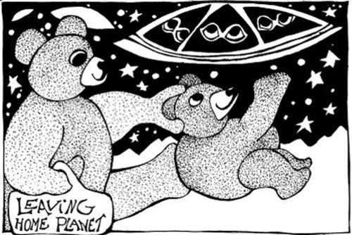
Another fine piece of narrative is a sort of science fiction story about the Florida wars set in the not-too-distant future. This neatly brings us back to my friend in the airport noticing the star tattoo on my foot. I can’t help but mention this story as part of the narrative involves how all the Florida natives were branded with dolphin tattoos on their left foot. It was the only way to try to establish some order during those very disturbing times! This is weird comics at its best, an intoxicating combination of inventiveness and sly humor.

One final example is the story, “Squatters of Trash Island, Part 2,” one of the most recent works, from Silver Sprocket, March 2017. It is clearly one of the more polished and developed of the sequential pieces here. This is pure Dada art fun as the story kicks off with two representatives from a a soft drink company tasked with removing any labels from discarded soda bottles with the company brand that have somehow reached a very disreputable landfill island. The two soda pop guys are shocked to find an entire community of people quite happy to live amid their own filth and, from time to time, copulate with dolphins. It’s a story that fits in well, with its strange beauty, within our own strange times.

1 Comment

Filed under Comics, Comics Reviews, James the Stanton, Seattle

FONDANT #2 by J. Webster Sharp review – Surreal and In-Your-Face

To say that J. Webster Sharp is a visionary comics artist is a very good place to start. I was immediately intrigued by what I saw of her work on her Instagram and I knew I’d need to take a closer look. Having read the last five of her works in comics, I can confidently say that this is someone who tapped into something special early on and continues to blossom. Jemma’s latest book which I’ve received is Fondant #2, and it is easily her most powerful work. This is in-your-face stuff, delving into deep psychological and sexual issues, and bringing to mind such artists as Phoebe Glockner and Renee French. I applaud what she is doing and would like to share a bit of what I’ve observed.

If I’m really being honest, I am fascinated by Jemma’s daring and inventive play with the theme of feet. I’ve always been interested in feet on various levels, not the least of which is as a subject for art. So, it’s nice to see a fellow artist on the same page. Jemma certainly confronts the foot theme from a wide variety of vantage points, spanning from cadavers to tortured cathartic acts. Like much of what she does, feet are rendered in such a way as if encrypted within a larger psychological landscape–especially with her distinctive pointillist style. If you scan the pages too quickly, you might miss a lot. And, if you linger, it can be a combination of unsettling and satisfying. Yes, it pays to be honest. I do so love feet, particularly depicted in unusual and provocative ways. I’m sure there’s a number of stories behind each of  these depictions. I like what I see from this very honest and daring artist.

What is so impressive to me about Jemma’s latest book is how she reached a point where she was ready to just completely let loose. This book is totally wordless and confidently so. There’s no need to explain anything. You simply don’t need any form of text to accompany an image of breasts with teeth instead of nipples. That pretty much speaks for itself. The rest of the book plays with more body horror as well as various other surreal imagery involving exotic animals, bondage and strange lab experiments. It’s all quite unusual, fascinating and thrilling. If you enjoy work of a more adult nature, then this is for you. Obviously, this is highly charged work that is unafraid to be, at times, more dark and challenging. But it’s not simply shock value that Jemma is after. Like Phoebe Glockner and Renee French, the work of J. Webster Sharp is invested in cultivating mystery and wonder through finely-crafted work. As I suggest, you will be rewarded for taking the time to linger upon a page. You may even find that you like what you see more than you realized.

3 Comments

Filed under Comics, Comics Reviews, Comix

Comics: ‘Leaving Home Planet’ by Hurricane Nancy

Making Changes comic strip by Hurricane Nancy

Hello, friends, Hurricane Nancy graces the site with another Making Changes comic strip. This one is entitled, “Leaving Home Planet.” Here are some notes from Nancy on this comic strip:

“Leaving the Planet is the old story, your parent kicks you out to go to college some such thing and on the planet of the Teddy bears there is public transportation to the college planet (and others not in this strip). So our teddy goes. There are sentient beings from other places.

The teddy also hooks up with a gal from another planet at college and heads back  to teddy planet with her and their kid. By public interstellar transportation.”

Be sure to visit Hurricane Nancy at her website right here.

6 Comments

Filed under Comics, Hurricane Nancy

Interview: Artist Matt MacFarland and ‘More Seasons of Gary’

A Comics Chat with Matt MacFarland

Matt MacFarland is a talented artist who makes some very intriguing comics. In this conversation, we discuss Matt’s latest work, a book focusing on his father, More Seasons of Gary, published by Zines and Things. You can read my review of it here. And we also discuss his series, Dark Pants, and get a sneak peek at the next, and perhaps final, issue to that series.

MORE SEASONS OF GARY

There is quite a lot going on in Matt’s work with its explorations of relationships and social commentary. More Seasons of Gary is a great jumping off point if you’re new to Matt’s work. It is a little master course in how to tell family stories. With a light and balanced approach, MacFarland addresses the issue of alcohol addiction that his father struggled with. Bittersweet remembrances provide a complex and fair portrait.

SCENES FROM A MARRIAGE

Scenes from a Marriage is another of Matt’s projects and this one is just as offbeat and subversive as the best of MacFarland’s humor although it might look more like a conventional family comic strip at first glance. There’s definitely an elegant air of mischief. You can find some samples of it on Matt’s Instagram.

DARK PANTS

Dark Pants is where it all began. You can read one of my reviews covering the first two issues here. This is a series of cautionary tales about a supernatural pair of skinny black jeans that take over whoever ends up wearing the pair. Whoever wears the jeans is empowered to seek out their darkest desires. It is an excellent example of the artist-cartoonist aspiring to the highest levels of his craft. I look forward to more of this kind of this quirky and engaging work.

This is a really fun interview and I’m so glad I got a chance to catch up with Matt, a dedicated artist without a doubt. We even discuss the legacy of R. Crumb! Be sure to visit Matt here. And seek out More Seasons of Gary, published by Zines and Things.

Leave a comment

Filed under Comics, Interviews, Matt MacFarland

Review: THE COLA POP CREEMEES by Desmond Reed

THE COLA POP CREEMEES!

The Cola Pop Creemees. Desmond Reed. Self-published.  2021. 232pp. $25

Desmond Reed has gone deep into cartoonland and delivered one very groovy book of comics goodness. Reed’s loopy characters literally dance upon the page. It’s a combination of whipsmart humor and design that will charm readers of all ages. There’s always room for another work in comics about a group of young people in a band, everything from Beatles comics to Josie and the Pussycats. But leave it to an ambitious indie cartoonist like Desmond Reed to take this genre into left field and high gear. The band of merry makers put the pow, buzz and boom into their music.

Just a kid with big dreams!

The artwork explodes upon the page in an amazingly smooth and natural way that you’d think Desmond Reed always drew this way. His previous book is something completely different, a shaggy dog homage to underground comix with heavy crosshatching and gross out humor. In comparison, his latest book is clean and crisp in execution and utterly charming in its sophisticated whimsy. It makes me think that it requires a good deal of planning ahead in order to get this precise look. It is after the artist has been toiling away, maybe not having the most fun, that the end result provides such a joyful reading experience.

Life in the big city.

The stories in this book revolve around a group of bohemian friends who have formed a band, the Cola Pop Creemees: Ralph Jonathan, Wallace T.J., Henrietta Susan, Gil Christopher and Mona Gertrude! The reader gets to see them struggle under authority figures and find their unique voices. Then the fun continues with various separate stories on each character. Maybe you’ve caught their misadventures on Instagram (@desmondtreed) and you’ve wondered if there might be a book collection. Well, there is and the first batch is sold out with plans for more in the near future. These comics are just too good to not give a proper shout out right now. Stay tuned for further developments by following Desmond Reed on Instagram (@desmondtreed)!

Mother never got it.

1 Comment

Filed under Comics, Comics Reviews

Review: MORE SEASONS OF GARY by Matt MacFarland

More Seasons of Gary. Matt MacFarland. zines + things. 2021. 48pp. $7

Matt MacFarland displays a disarming charm in how he presents himself, his family, and his father in particular in his latest book. This is a little comics memoir in the tradition of auto-bio alt-comics: a self-portrait of the cartoonist, warts-and-all.

It’s interesting to note that this story is told in segments, four panels per page, comic strip-sytle. MacFarland uses the comic strip format in order to contain the narrative. What I mean is that this isn’t a collection of previously serialized work. I see part of it on Matt’s Instagram but not as being posted in a deliberate way like a webcomic. He takes a more casual approach which I really dig. In fact, a lot of what he’s posting right now are pages from his Scenes from a Marriage series which is hilarious. Matt has found a method to keep things fresh and concise by using the comic strip format to tell his story. He’s also taking advantage of the fact that we’re so used to reading page after page of comic strips that have been collected to tell a bigger story. Matt’s new book features his father, told in a series of comic strip moments. This format echoes Art Spiegelman’s own recollections of his father albeit on a small compact scale. Matt has narrowed down the stage to the most essential: fleeting moments, heavy with meaning, tied together by the seasons. What emerges is a portrait of the artist’s father, a complicated guy, both difficult and lovable.

By keeping to this comic strip format, MacFarland provides us little windows into his father’s soul, one self-contained little story per page. MacFarland has a lean and crisp way of drawing and storytelling. This series of four-panel comic strips grows on you as one detail is revealed and builds upon the next. We begin with the fall. The first two strips set the tone depicting Matt’s father, Gary, as a less than sensitive guy, with an offbeat sense of humor. The opener shows Gary as a young boy obsessed with creating monster masks. The one after that has Gary describing a horror movie he especially liked to 6-year-old Matt. After Matt screams that he wants to see it, Gary shows him a particularly disturbing scene from it on tape that leaves little Matt in tears.

Truth be told, Gary is hardly a bad guy and Matt doesn’t pick him apart. He’s not digging for dirt but for understanding about his father–and his own life. As we progress, we come to find out that Gary is an alcoholic but that is only part of his story and it doesn’t derail the narrative as one might expect. Mixing up the chronology of events also helps in letting details emerge in a less than obvious way. In a natural course of presenting anecdotes, the reader gets to see Gary interact with an array of people and circumstances. MacFarland manages to navigate a series of challenging periods: the divorce of his parents; the start of his own family; and the death of his father. I especially like a moment Matt has crafted where he’s hiding in a bedroom crying over the news of his father’s death while also calculating in his mind when the dinner guest will finally leave. Of course, when he returns to the kitchen, she’s still seated at the dinner table. That’s classic Matt MacFarland, with a dash of dry and dark humor.

6 Comments

Filed under Autobio Comics, Comics, Comics Reviews

One More Look: ‘A Dangerous Woman: The Graphic Biography of Emma Goldman’

A DANGEROUS WOMAN

A Dangerous Woman: The Graphic Biography of Emma Goldman. by Sharon Rudahl. edited by Paul Buhle. The New Press. 2007. 115pp. $17.95

Emma Goldman (1869-1940) is not an obvious choice for the subject of a graphic novel. Unless you’re into political science, you probably have never heard of her. But since when is it an obstacle to read a book about someone you’ve never heard of? It’s absolutely not an obstacle. More of an invitation. You see, Emma Goldman was a trailblazing anarchist who became known as “Red Emma” and, when she was deported from the United States in 1919, J. Edgar Hoover called her “one of the most dangerous women in America.” Comic artist Sharon Rudahl brings Emma Goldman to life in her graphic novel. It was a pleasure to review Rudahl’s graphic novel on Paul Robeson. You can read that here. And it seemed only natural to take one more look back to her graphic novel on Emma Goldman.

Continue reading

Leave a comment

Filed under Comics, Comix, Sharon Rudahl

Review: ‘The Complete Works of Fante Bukowski’ by Noah Van Sciver 

The Complete Works of Fante Bukowski

The Complete Works of Fante Bukowski. By Noah Van Sciver. Seattle: Fantagraphics Books, 2020. 452 pp. $39.99.

Noah Van Sciver is an interesting cartoonist. He’s long graduated from being one of “those to watch” to an artist with a substanital track record. As a cartoonist myself, I admire and appreciate what he’s doing. He is best known for his lovable loudmouth character, Fante Bukowski, a confused mashup of Charles Bukowski and John Fante. The ongoing joke here is that Fante Bukowski is a perpetually aspiring writer, both artless and clueless. If you haven’t jumped on the Fante Bukowski bandwagon yet, now is the time with the release of The Complete Works of Fante Bukowski, which collects every mishap and stumble all the way on a crazed quest for fame and fortune.

Fante dreams big.

I think that Fante is a very successful character. Van Sciver has developed something that people can easily relate to. Despite the fact that Fante is associated with the literary crowd, there’s nothing highbrow about him. If nothing else, Fante is accessible. You can think of him as the Homer Simpson of lost souls. In a higher sense, Fante is a perfect vehicle for Van Sciver to skewer any lofty notions about art. But even suggesting this may only make Van Sciver laugh. For something really serious and dark, he’d direct you to his graphic novella, Saint Cole. There’s definitely loads of irony and irreverence attached to Fante. On a more basic level, you can replace any literary stuff in here (replace it with general office culture, academia or even indie comics culture) and enjoy this as a story about a guy who is not much more than a professional wedding crasher, a latter day Groucho Marx out to expose hypocrisy and pretentiousness in all its many forms even if he’s not aware of it. The character is funny, gets into silly situations, and will make you laugh. But there’s more.

Fante Bukowski demands to be taken seriously as a writer. Van Sciver presents us with the journey of a misguided young man who really has no great talent, skill or genuine passion. Fante simply feels entitled to be a success. Fante will make some effort, just the bare minimum, towards his dreams, and expect instant results. His bare minimum efforts are garbage but he refuses to take no for an answer. All in all, this is very funny stuff. Imagine Steve Martin, in his prime, in the role of Fante. Or Ricky Gervais. However, given all the work it took to set up the premise of Fante, it would have been interesting if the satirical aim was a bit more precise if that were possible. As it is, Fante does indeed have hilarious moments like when he’s courting favor with a “literary journal” he’d like to have his work in, the Firewarter Journal, with such a perfectly pompous name and a circulation of a dozen to match. These are the sort of pleasant jabs that you might expect from the comic strip, Doonesbury, but more generic. Ultimately, Van Sciver succeeds by keeping his humor broad.

A romantic but stupid idea of being a writer.

Van Sciver seems to root for irreverence more than anything as a way to move things along. He doesn’t want anything to be taken too seriously, including his own work. He’s not trying to be Dash Shaw. And he doesn’t seem to aspire to write a true comedy of manners like cartoonist Posy Simmonds although he does a fine job with the social commentary he does end up doing.  More importantly, he  has definitely invested quite a lot in the idea that Fante Bukowski is a clueless young loudmouth who is completely absorbed with entitlement. That alone is key. A lot of other tidbits up for satire can be lightly played with. The big takeaway is that Fante Bukowski is a young empty suit. He feels he is owed something with apparently nothing to show for his outrageous demands. If, in spite of this fact, Fante did find his fame and fortune, then the joke would truly be on us.

While much care has been taken, Van Sciver has also made sure to leave a certain amount of a raw quality to what he does–and there is a long-standing tradition for that in indie comics and in art in general. You want to avoid getting too polished, too slick. You want to look the opposite of “corporate.” So, you’ll see the artwork is only refined up to a certain point. Some cartoonists, for example, will deliberately misuse digital coloring to subvert the idea of making things look too pretty. Van Sciver, for example, could have easily chosen a way to seamlessly clean up any mistakes in his text but he wants you to be aware of them. He has pasted over by hand every correction to his text and made it so that you clearly notice it. Whatever the reason, it reads as a style choice.

Unlucky in love.

Following this subversive impulse, Van Sciver does the same for the actual story. Nothing is supposed to be taken too seriously–and that does make sense when you’re poking fun at all those “highbrows” who take themselves too seriously, right? That notion is where you might find some subtext. Van Sciver peppers his comics with all sorts of quotes from various famous writers and artists and, within this loopy context, even the best lines from Hemingway or Fitzgerald all sound like sayings from fortune cookies. For a book that seems to be in it just for laughs, taking a blowtorch to the old masters has some bite to it. But no one really wants to topple truly great writers, do they? Maybe so but going down that rabbit hole is a pretty tall order. In the end, it seems that we’re supposed to turn our gaze back to Fante Bukowski and maybe pity the poor fool.

Noah Van Sciver is an Ignatz award-winning cartoonist who first came to comic readers’ attention with his critically acclaimed comic book series Blammo. His work has appeared in the Best American Comics and the Fantagraphics anthology series NOW. Van Sciver is a regular contributor to Mad magazine and has created many graphic novels including The Hypo and Saint Cole. His latest, The Complete Works of Fante Bukowski, collects all three volumes of the Fante Bukowski series in an expanded hardcover edition with extra features and special material. His follow up, Please Don’t Step on My JNCO Jeans, will be published in December.

Long live bohemians, great and small.

Leave a comment

Filed under Comics, Fantagraphics, Fantagraphics Books, Graphic Novel Reviews, graphic novels, Noah Van Sciver

Cartoonist Morgan Vogel (1986-2020)

Morgan Vogel

I’ve been carving a little niche of some kind for many years and sometimes wondering where it all will lead—but I do know. I just mean that, push comes to shove, I will occasionally feel obligated to account for my actions. From time to time, all of us indie creative types must ask, “Why are we all doing this?” Indeed. We do it because it’s rewarding in its own right. As we progress through life, I think a lot of us out there begin to think we’d better be a little more respectful of our own work/worth. Why not? It makes sense. That brings me to this post, a look at Morgan Vogel, a remarkable talent now gone all too soon.

Cover to The Necrophilic Landspace by Morgan (then Tracy Auch) published by 2dcloud, 2015

From time to time, I feel compelled to define/explain what I do and this blog is a very good place for that. What I want to share with you right now is a little moment in time, because that is mostly what this blog does, filter through, and grind out some truth. Today, I bring up to the surface a remembrance of a young artist who recently passed away. Morgan Vogel, a name many of you will not know. But she fits the bill for the type of curious creature I hold in high esteem. Morgan was a determined artist. To die at 34 is truly heartbreaking. She was only beginning. I want to direct your attention to a tribute posted by Austin English over at The Comics Journal. Austin English runs Domino Books, a fine online boutique of comics and zines and he’s quite an authority on the indie zine. Austin leads a moving tribute that gives me confidence that Morgan’s legacy is safe and won’t be forgotten. Here’s Austin’s introduction:

Morgan Vogel, a cartoonist known for her distinctively intelligent work, went missing on April 8th. She was found dead Sunday, May 24th, at age 34. While her body of published work was small, its effect on those who read it was immeasurable. Her comics in anthologies (she appeared in Weird Magazine, Smoke Signals, Suspect Device, Tusen Hjärtan Stark, But is it…Comic Aht? and more) were often the stand out piece of the volume in question. The Necrophilic Landscape, a solo masterpiece published by 2dcloud in 2015, is one of the most stunning works of comic art in the last decade. Her recent self published zines, Valle and Nightcore Energy, were beautifully drawn and upsetting to read, a divide that appears in so much of her art and became more pronounced over time. 

Morgan was a favorite cartoonist of mine and many others. Her work was, at once, cruel, funny, forgiving, un-affectionate and, most of all, incredibly perceptive. She often zeroed in on personas that people (in much of her work, artists specifically) constructed for themselves. She would at first offer a satire of these poses, but within a few panels, a more moving–and therefore devastating–portrait of the subject would be revealed. The maturity of her expression, the avoidance of an extreme of anger or acceptance but instead a complicated and upsetting synthesis of the two, was achieved with a precision that I rarely see in comics. Many of my favorite artists make work that, on a superficial level, seems confrontational, but at heart is urgently humane—Morgan’s work, to me, got at this better than most. When I wanted to start a magazine about comics, including Morgan’s work in whatever way possible was one of the highest priorities, because of the nature of her views on art. She wasn’t interested in style or gestures of sophistication, but instead on the true implications embedded within peoples art. In one remembrance below, a quote by Morgan is repeated: “I  cant think of any other way to love except through artwork or some other medium that is public, loving everybody is easy, when you have an actual commitment to a thing or to somebody then it gets more complicated than I can handle.” A belief in the power of art often gets a lot of lip service, but for many artists of consequence, it is a real and specific thing. Morgan, I believe, was one of those artists. 

Morgan’s work was well known to her peers and to many readers, but because she worked under so many pseudonyms (I originally knew her as Caroline Bren, then as Tracy Auch, later as Hennessy, and finally as Morgan or Morgan Vogel), the entirety of her output remains a tangle. I think this is, in part, how she wanted it. But I also know that she was an avid reader of this website and focused much of her thinking on cartoonists and cartooning history. There are no doubt people reading this with feelings about the form that mirror Morgan’s. In spite of her resistance to clarifying her body of work, attention and discussion of it seem important to fulfilling the belief she had in the medium. I think Morgan’s high standards for cartooning were often met most precisely by her own art. It’s hard for me to imagine an artistic achievement equal to that. 

Pages from The Necrophilic Landspace

The Necrophilic Landspace is 32 pages, 7.75 x 9.25 inches, 1 color risograph, $12, available at 2dcloud.

1 Comment

Filed under Comics, Indie, Obituaries, Zines

Review: NOT MY SMALL DIARY #20

Not My Small Diary #20

A worthwhile comics anthology requires a lot of focus and dedication. One comics anthology series that has set a high standard is Not My Small Diary, edited by Delaine Derry Green. For Issue 20, Green chose the theme of music and the affect it has on our lives. This is a theme that is tailor-made for indie cartoonists since they already spend quite a lot of time creating auto-bio comics while listening to music. I should know. I am one of them and I salute the efforts of my fellow cartoonists included in this collection. If there is one thing we all seem to have an opinion on, and cuts deep, it’s music. We all operate under this illusion that we somehow own our all-time favorite bands, since they seem to speak directly to us. Nothing could be further from the truth but the power of music is unmistakable. With that in mind, let’s take a closer look at Issue 20.

David Lasky

In Delaine Derry Green’s introduction she states that this edition includes 54 artists and writers. But one cartoonist, who had submitted work to every issue since the very start in 1996 was now gone. “We lost Mark Campos in 2018,” states Green, “and I know he would have loved the theme of this issue. This issue is dedicated to him!” Two cartoonists in this issue grapple with the loss. David Lasky presents an exploration of his feelings as he mourns the death of his friend and connects it to a better appreciation of the work of an older and wiser George Harrison. Noel Franklin presents a behind-the-scenes look at her relationship with Campos and their mutual admiration for the dark beauty in the work of Kristin Hersh. Each tribute approaches the subject from very different and idiosyncratic perspectives. In Noel Franklin’s piece, there’s a moment when Lasky introduces her to Campos.  Reading these two comics back-to-back, a reader can get a sense of the peculiar and the perennial within the creative mist and fog.

Noel Franklin

A good work of auto-bio comics must make efficient use of its allotted space, even if it’s only one page. When a cartoonist lacks discipline, one page can feel too long. But, if a cartoonist is mindful of their content, then a series of pages can leave the reader wanting more. Three or four pages is typically as long as one can expect for an extended piece. M. Jacob Alvarez brings the reader in with his honest and concise observations of growing up with music for his 3-page work entitled, Record Player. Peter Conrad makes good use of four pages with Hacklebarney, which also features coming-of-age musings over music. Both Alvarez and Conrad don’t claim any cosmic connection to music. On the contrary, it was always something in the background for them until further notice. It’s a refreshing take to have indie cartoonists downplay a situation as opposed to the traditional life-changing narrative.

M. Jacob Alvarez

Not My Small Diary #20 includes the work of Colleen Frakes, Joe Decie, Andrew Goldfarb, Androo Robinson, Aaron Brassea, John Porcellino, Rob Kirby, MariNaomi, Julia Wertz, Jenny Zervakis, Jonathan Baylis, T.J. Kirsch, Simon Mackie, David Lasky, Noel Franklin, Misun Oh, Danny Noble, Fafá Jaepelt, Billy McKay, Chad Woody, Max Clotfelter, J.T. Yost, Ben Snakepit, J.M. Hunter, Jason Marcy, Steve Wallet, Jesse Reklaw, Ken Bausert/Steven Anderson, Michael Kraiger, George Erling, Joseph Cotsirilos, Aimee Hagerty Johnson, Jason Martin, Kevin Van Hyning, Pete Wentzell, Josh Medsker, Roberta Gregory, James Burns, Brad W. Foster, M. Jacob Alvarez, Tom Scarecrow, David St. Albans, Peter Conrad, Maddie Fix, Joel Orff, Dave Kiersh, Donna Barr, Sally-Anne Hickman, Missy Kulik, Jim Siergey, J Gonzalez-Blitz, Jennifer Hayden, and Carrie McNinch. Cover Artist is Ben Snakepit.

Peter Conrad

Not My Small Diary #20 is a 136-page book well worth the $6.50 price point. I really appreciate the guitar pick included with every copy. But I appreciate even more the index at the back of the book that references all the bands mentioned! Considered one of the best showcase zines around, this is the book to explore some of the best in indie comics. Visit Not Small Diary right here.

Leave a comment

Filed under Comics, Comics Reviews, Music